Thursday, November 15, 2012

Fallen Logos


This is Fallen Logos
I used 2 simple tools in the creation of this AMAZING LOGO!!! I used the pen tool for the F and L I also used the shape tool (rectangle) for the back ground and placed a white to black gradient in the back ground to make it look awesome but all the colors can be substituted for whatever color you choose. I encountered One problem in the making of this logo. It was with the Pen tool while i was making the F and L i tried to make a line go through both of them like / and i hope it worked.

Tuesday, November 13, 2012

splat

This is my splatter project, in this project we got to work more with 3 dimensions with was pretty cool.
There was only ONE problem that absolutely KICKED MY BUTT!!! it was making the words MATT in
3-d because it would make a copy of it twice so it was like two Matt's back to back so it was just a big mess. I overcame this problem by re reading the tutorial and it turns out i skipped a step so i just did it.

Friday, November 9, 2012

This is my Farmers Insurance company logo.
i chose this design because i wanted something that everybody knew and was timeless, unless we move to mars or the moon one day....
The design of this project was not hard, the only problem i faced was when i made the words type on the globe the blue background that it had would go away. So i fixed it by making another circle the same size just a little big bigger and filled it with non so it would not get rid of the blue.
the next problem i had was making the land but that was just a bunch of trial and error so it wasnt really a actual problem.

Thursday, October 25, 2012


This is my personal Expression project
 I chose the background to be brown and white because it is a neutral color, so I could make the colors I use for the words stand out more.Since my head was cut i made the word brain with individual text boxes and changed the font for each letter to represent the creativeness of my brain!!!!! eh its not that creative but i try, and for the word sticky I un-grouped all the letters and made the st ic and ky stick together because the word is sticky!

Thursday, October 18, 2012

This is my attempt at making the Lilly pads as shown in the tutorial.
I started with gradient mesh and had to put different shades of blue to make it give the illusion of distance.
then I made the lily pads and it was pretty easy. Now for the part that gave me the most difficulty was making the flowers on the lily pads, I just could not get the pen tool to work.in the end of course i got the pen tool to work but was still really hard. After that i made the ripples in the water and then made the ovels with the eclips tool and put it to 20 percent

Tuesday, October 16, 2012

bellwork oct 16

object> create gradient mesh
then you select the Direct Selection tool (A)
then you click what anchor point you want

Thursday, October 11, 2012

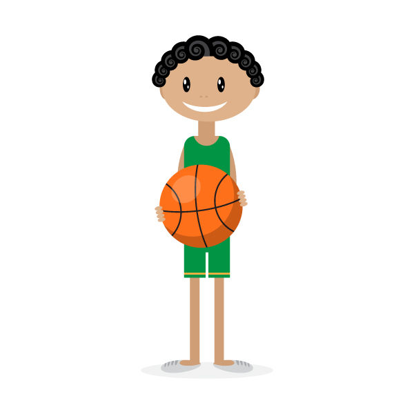
The top image is the one I had to try and copy, the bottom is my attempt.
I really enjoyed this project, because i learned to use a bunch of different tools( like the knife tool which is like playing fruit ninja!) and it help me progress. i encountered a few problems. the neck or where the neck and the chest are so post to connect i had trouble getting the lower part connecting to the neck so there is a sliver of green in the back ground. After that i made the basketball and I had a problem making the fingers proportional comparably to the basketball. But in all I would say that my attempt at the kid is a little bit bigger than the original.